B.10.0 - Kenney House signage - 611 W. 22nd Street — original pdf
Backup

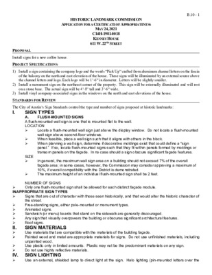
HISTORIC LANDMARK COMMISSION APPLICATION FOR A CERTIFICATE OF APPROPRIATENESS MAY 24, 2021 C14H-1981-0018 KENNEY HOUSE 611 W. 22ND STREET B.10 - 1 PROPOSAL Install signs for a new coffee house. PROJECT SPECIFICATIONS 1) Install a sign containing the company logo and the words “Pick Up” crafted from aluminum channel letters on the fascia of the balcony on the north and east elevation of the house. These signs will be illuminated by an external source above the channel letters and logo. Each logo will be 1’-6” in diameter. Letters will be slightly smaller. 2) Install a monument sign on the northeast corner of the property. This sign will be externally illuminated and will rest on a stone base. The actual sign will be 4’-8” tall and 3’-6” wide. 3) Install vinyl company-associated signs in the windows on the north and east elevations of the house. STANDARDS FOR REVIEW SIZE II. The City of Austin’s Sign Standards control the type and number of signs proposed at historic landmarks: I. FLUSH-MOUNTED SIGNS SIGN TYPES A. A flush-mounted wall sign is one that is mounted flat to the wall. LOCATION Locate a flush-mounted wall sign just above the display window. Do not locate a flush-mounted wall sign above second-floor windows. When feasible, place a wall sign such that it aligns with others in the block. When planning a wall sign, determine if decorative moldings exist that could define a “sign panel.” If so, locate flush-mounted signs such that they fit within panels formed by moldings or transom panels on the façade. In no case should a sign obscure significant façade features. INAPPROPRIATE SIGN TYPES In general, the maximum wall sign area on a building should not exceed 7% of the overall façade area; in some cases, however, the Commission may consider approving a maximum of 10%, if overall compatibility with the District is demonstrated. The maximum height of an individual flush-mounted sign shall be 2 feet. NUMBER OF SIGNS Only one flush-mounted sign shall be allowed for each distinct façade module. Signs that are out of character with those seen historically, and that would alter the historic character of the street. Free-standing signs, either pole-mounted or monument types. Animated signs. Sandwich (or menu) boards that stand on the sidewalk are generally discouraged. Any sign that visually overpowers the building or obscures significant architectural features. Roof signs. SIGN MATERIALS Use materials that are compatible with the materials of the building façade. Painted wood and metal are appropriate materials for signs. Do not use unfinished materials, including unpainted wood. Use plastic only in limited amounts. Plastic may not be the predominant materials on any sign. Do not use highly reflective materials. IV. SIGN LIGHTING Use an external, shielded lamp to direct light at the sign. Halo lighting (pin-mounted letters over the B.10 - 2 lighting source) or recessed can lighting in awnings are acceptable. DO NOT USE: 1. 2. 3. Internal illumination Fluorescent lights Sodium vapor lights. VI. GENERAL DESIGN CONSIDERATIONS Consider the building front as part of an overall sign program. Coordinate signage with the composition of the façade, including ornamental details. Signs should always appear to be in scale with the elements of the façade. Signs should be in proportion to the building and must not dominate the façade. Develop a master sign plan for the entire building front and coordinate signage for different businesses within the same building. Locate a sign on a building to emphasize design elements of the façade. In no case should a sign obscure architectural details or features. Mount signs to fit within existing architectural features. Signs should help reinforce the horizontal lines of moldings and transoms seen along the street. The total area of all sign faces on a façade module may not exceed 20 square feet. The proposed signage to be mounted to the building complies to the city’s sign standards in terms of the number of signs, material and size, and illumination. The applicant is entitled to one sign per façade. The proposed vinyl letters in the windows do not constitute separate signage, and similar proposals have been approved in downtown buildings. The free- standing monument sign does not comply with the sign standards, but the sign standards were developed for downtown locations, and the Commission has approved free-standing monument signs for landmark properties in similar once- residential settings. The proposed project can be approved based upon compliance with the standards and long-time precedent. COMMITTEE FEEDBACK Not reviewed. STAFF RECOMMENDATION Approve the application with the exception of the “Pick Up” over the principal entry to the house. The logo in the fascia above the door should be sufficient for this location, and the additional “Pick Up” letters at this location does not seem necessary. B.10 - 3